Magazine 1
Front Cover
The main colours used on the front cover are red, yellow, and black. The colours are very bold which gives the impression that the genre of the music this magazine is for is upbeat. White is also used for a few of the subheadings. The white contrasts with the bold colours and stands out.
A mid shot of two men are shown who are staring right in to the camera. This has the effect of making the audience feel more engaged with the music magazine as the men seem to be staring right back at them. They also seem very confident due to staring directly in to the camera and could come across as intimidating. This adds to the genre of the music being strong and fast.
Surrounding the men are fake buildings which seem to be made of cardboard. This most probably has a connection to the name of the band as a sub heading includes ‘Hot City’. The use of red in the magazine could have a connection to fire, and the sub heading ‘burning up’ further supports this.
The name of the music magazine is ‘DJ’ which immediately gives away the genre of music. It is in yellow bold font making it stand out and one of the men are partly blocking it. This means that people do not need to be able to see the whole title as the magazine is known well. The headings are all in different fonts which could suggest variety and that the magazine has many different things included in it. It also gives the magazine cover an overall casual look making it more appealing to teenagers.
The price of this magazine is £3.95 which is more expensive than most magazines. This could mean that the quality and content of the magazine is better than most and that the magazine is popular.
Contents
The contents page is much more colourful than the front cover and includes colours such as blue, pink, black, and gold. The background is plain white making the text easy to read and subheadings are used to divide the magazine in to sections making it simpler to find the page you are looking for.
The title ‘contents’ is in the top right. The font is much more discrete and simple compared to the type of font used in the front cover. This is because the purpose of the front cover is to attract their audience but the contents is usually looked at after the magazine is bought, and is much more informative.
The layout of the text is in columns. This adds to the contents being simple and easy for the readers to find what they want.
Images are on the right and bottom which are mostly of people. They all connote dance music and clubbing.
Double Page Spread
The main colour used in this double page spread is yellow and white. These are used so that the reader can read the text easily. Yellow is also a bright colour and could have a connection to bright lights in a club and therefore upbeat music.
The layout of the interview is the question being shown first in bold text, and underneath that the answer. This is quite a simple format and helps the reader to understand what is going on. On the right is a yellow box which has more text in it. This is put in to a yellow box as it is a different topic to what the interview is about, and goes through the entertainer’s choice of music.
In the centre is an image of a man holding a bag in one hand and a pair of headphones in the other. This gives the idea that the man is a DJ. The fact that he is in the centre shows that the double page spread is on him. He also is staring directly in to the camera like the men on the front cover. This makes the audience feel more of a connection towards this man and therefore appeals to them more.
The text is standard and the heading is in large bold font to make it stand out.
Magazine 2
Front Cover
The main colours on the cover of this magazine are red, white, and black. The black contrasts with the white, and makes the white and red stand out. The colours work very well as they attract both male and female.
 The image is hard to make out, but the setting looks like a club or party with people dancing at the bottom and a DJ above. You can also tell that it is a dark setting with bright lights and smoke. This image gives the impression that the music genre this magazine concentrates on is dance or techno music. Faces are not visible in the image so the audience may not feel a connection with it. Howerer, this makes it more mysterious and customers may want to know what the magazine is about.
The font used on the magazine is bold and a lot of the text is in uppercase. This is to make the text stand out. There are subheadings on the sides of the magazines so that it does not cover up the image too much. Above the mast head is a subheading saying ‘the world’s biggest dance music and clubbing magazine’. This clearly tells the audience what this magazine is about. It could also mean that the magazine is not well known as they have to tell the audience what it actually is.
The name of the magazine is ‘Mixmag’. This could mean that the music in the magazine is a ‘mix’ of different genres but more likely that it is a dance magazine as it has a connection with mixing songs and ‘DJ’ type music. ‘Mag’ relates to it being a magazine. Part of this heading is covered which means that it is a popular magazine and people do not need to see the whole of the name to know what it is.
The price which is located at the bottom right of the cover is £4.20. This is quite higher than most magazines but this is because it comes with a CD.
Contents
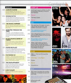
 The colours used on the contents page are very similar to the colours used on the front cover. These are black and white. However, yellow has been used for some of the text such as the issue and the page numbers but most of the text is in white. This stands out from the black and makes it easier to read.
The layout is unique and has a large image on the left and text on the right and bottom. This makes the structure very simple and clear for the readers to know what page number they want. The font on this page, compared to the cover is much more discrete and basic. This is because the contents page is to inform rather than attract customers.
The image on the left is of two young girls who look like they are at a club. This is because of the bright yellow light shining on them and they’re facial expressions. The use of only women could mean that the magazine is mainly trying to attract men. The image is very colourful and contrasts with the black background. It is also large which gives the contents page a spaced-out, simple look.
Double Page Spread
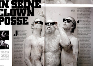
 This double page spread uses consists of mainly grey and white. These shades make the pages look simple and vintage.
 The title is in large bold font so that it stands out and the text is in columns, which gives the impression that there is not as much to read. It also spaces the text out so it is clearer to read.
On the bottom left is an introduction of who these men are and uses words such as ‘chaotic’ and ‘super hot’ to draw the readers in.
The main image is of three men wearing nothing but sunglasses. They also appear to be painted white and looking up. This image is very edgy and random which could have the effect of attracting young customers because it is different. It also makes the readers wonder what it is that they are looking at.


No comments:
Post a Comment