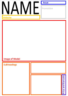
The title is at the top left. This is similar to many other music magazines such as one of the magazines I had deconstructed, DJ. The website is underneath the title so that it is easy for the readers to find.
The main image takes up most of the front cover as in my questionnaire I found out that one of the main things which attracted customers to buy the magazine.
The subheadings underneath give details about what is in the magazine and also attract customers to buy it.
This layout is very clear and the title, image, and subheadings are all spaced out making it easier for the reader to understand. However, it may be too simple.
The name of the magazine is placed on the bottom right. This is because it is unique and not many magazines have their names placed here. This would stand out from other magazines beside it in a shop and therefore people may be more persuaded to buy it.
The main image is in the centre left and is the only image on the front cover. This is because more images may make it look crowded and it also informs the customer that the person in the image is the main topic of this issue.
The subheadings surround the image which makes the cover look very clear.
The overall look of this layout is unique which an advantage is as it will stand out from the others. However, some customers may not like the fact that it is different or could give the impression that the quality of the magazine is poor.
The name of the magazine is at the top centre of the cover which is similar to how many other magazines have their names eg. mixmag, which is one of the magazines I deconstructed. This was the most popular place to have the title when doing the questionnaire. The website is underneath it so that it is easy to find.
Subheadings are placed around the top, bottom and sides of the magazine. This is very much like both the magazines I had deconstructed. This could give the impression that there is a lot of information in this magazine.
The image takes up the whole cover and is the background. This is another factor which is the same to most magazines.
This layout looks very professional as it is similar to most of the magazines out there, and will have the effect of making customers but it because it is good quality.
Out of all the layouts I have constructed, I find the last to be most attractive as it looks professional and is similar to most other magazine layouts. I think it is important to be the same as the other magazines to begin with because they are successful so their layout must be effective.


No comments:
Post a Comment