

This layout shows the introduction and title on the left page. This is to keep it simple and not confuse the reader to what is being shown. On the right page, the interview is shown in columns, making the text more spaced out and easier to read. Images are also on this page to draw the reader in and show them who is being interviewed.
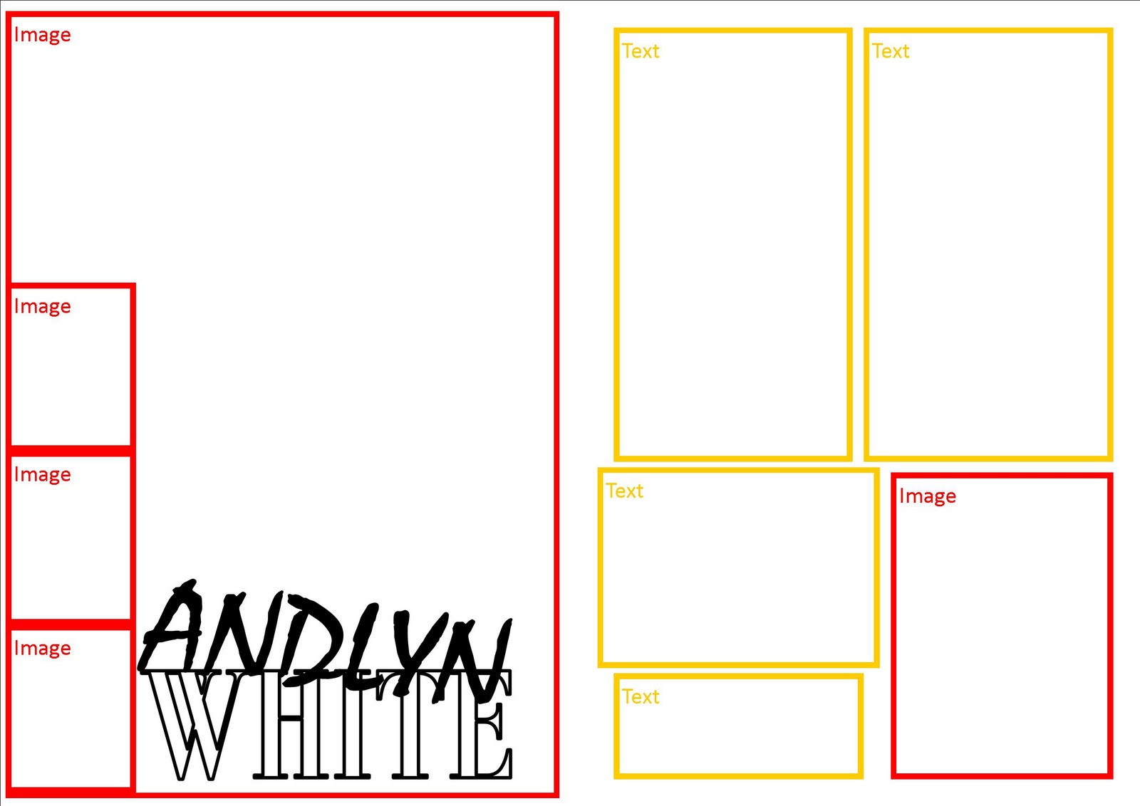
This layout is one where a large image takes up the whole of the left page with the title at the bottom. Snapshots of the celebrity are shown down the side to create a film effect and to further show the celebrity being interviewed. The right page mainly consists of text however there is one image on the bottom right.
 This layout is much more creative than the others as images have been slanted and shapes have been used. On the left page would be a large image of the model with an introduction to her at the bottom. A circle is in the centre of the two pages where the introduction to the interview will be. On the right page the actual interview will be shown as well as two other smaller images. One image has been slanted to decorate the page.
 The layout I prefer the most is the first layout because it is very simple and does not include too many pictures such as the second layout which includes five. This allows more room for text. The left page will draw the reader in with the text in speech marks, and is very easy to read and understand.
No comments:
Post a Comment